
Explore My Creative Universe
Cohesive Branding Designs
Branding is crucial for businesses and organizations because it helps define their identity, build recognition, and establish trust.
Following the Brand Guide
The provided media pieces pair together seamlessly through consistent brand design, utilizing APPA’s signature black, blue, and white color scheme, modern sans-serif typography, and clean layouts. Each piece incorporates bold headers, clear sections, and engaging visuals to maintain clarity and professionalism. The recurring use of the APPA logo and similar graphic elements creates a cohesive look across various formats, reinforcing brand identity while delivering key information in an organized, visually appealing manner. This unified design approach enhances recognition and trust in APPA’s communications.

APPA Proposal Deadline

Why Join APPA
This promotional flyer for APPA highlights key membership benefits, using a clean, modern design with a vibrant blue and white color scheme. The APPA logo is prominently displayed, and a central banner asks, “Why Join APPA?” to immediately draw attention. Clear sections outline benefits such as career advancement, networking, knowledge growth, and leadership, with concise descriptions and supporting icons for easy readability.

APPA New Opportunities
This design is a promotional flyer for the American Probation and Parole Association (APPA), announcing membership opportunities for new probation, parole, and community corrections officers. It features a bold, professional layout with a black, blue, and white color scheme. The design’s clean structure, concise text, and engaging visuals effectively communicate the value of APPA membership.

APPA PowerPoint Template
This PowerPoint template for APPA features a sleek, professional design consistent with APPA’s branding, using a black, blue, and white color palette. The layout is clean and modern, incorporating bold headers, ample white space, and subtle graphic elements for visual appeal. The template ensures clarity and engagement, it is designed to maintain brand consistency, it provides a polished and cohesive look for all APPA presentations.
These documents for TJFOC’s Annual Gala adhere to a specific brand guide, ensuring a cohesive and professional presentation across all materials. From invitations to programs, each piece maintains the organization’s distinctive color palette, typography, and design elements, reflecting the elegance and significance of the event while reinforcing the brand’s identity. The result is a unified, polished experience for attendees and stakeholders.
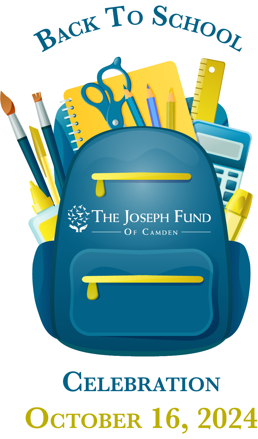
TJFOC Annual Gala Logo 2024
This logo for TJFOC’s Annual Gala features a book bag filled with school supplies, symbolizing the organization’s mission to raise funds for students heading back to school. The design combines elements of education and community support, conveying a sense of hope and empowerment, while aligning with the event’s goal of providing resources to students in need. The logo reflects both the cause and the festive spirit of the gala.

TJFOC Annual Gala Sponsor Doc 2024
This sponsorship opportunities document for TJFOC’s Annual Gala follows the organization’s established color palette and seamlessly incorporates the event logo. The design is clean and professional, highlighting the various sponsorship tiers while maintaining a cohesive and visually appealing layout. By aligning with the brand’s identity, the document ensures a unified and polished presentation that effectively communicates the impact and benefits of supporting the gala.

TJFOC Annual Gala Invite 2024
This trifold invitation for TJFOC’s Annual Gala features a simple yet effective design that highlights all essential event details in a clear and engaging layout. Using the organization’s color palette and logo, the design ensures a cohesive brand experience while providing a visually appealing, easy-to-navigate format. The invitation balances elegance with functionality, making it both informative and inviting for guests.